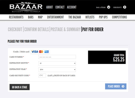
The checkout area is where the customer selects their preferred method of shipping and confirms their order by instructing you to take payment.
As your customer is not actually committed to making their purchase until they’ve actually handed over their money, you need to do all you can to safely guide them home by swiftly and efficiently taking their payment details and confirming their order.
And that fundamentally means reducing the chances of users abandoning their shopping cart by removing all screen clutter that can distract the customer and minimising the number of steps that they have to take to complete their purchase.
And that fundamentally means reducing the chances of users abandoning their shopping cart by removing all screen clutter that can distract the customer and minimising the number of steps that they have to take to complete their purchase.

CUSTOMER REGISTRATION
In order to make a purchase, the customer will need to provide you with details of payment and delivery, such as name, postal address, credit card details and contact numbers.
For returning customers, having to enter this information every single time they purchase can become incredibly tiresome. It is an unnecessary inconvenience that could make the difference between making a sale and losing that customer.
So when a new visitor purchases an item from your eCommerce site, you should allow them to register, so that you can store their full details in a secure database for later use. This means that, in future, the customer only need enter a user ID and password and the system will handle the rest.
Ideally the user ID should be the customer’s email address instead of a conventional username. This is because users often forget the username they created at the time of registration, but few forget their email address. Secondly, every email address is unique, so your eCommerce system avoids the problem of customers choosing the same user ID.
Another good reason for collecting customer information is that it creates a marketing database, allowing you to inform customers of special offers and new products or services.
However, you should always seek consent from the user to send them emails or SMS messages in the future – usually by means of an opt-in check box as part of your data protection notice.
OPTIONAL OR COMPULSORY REGISTRATION?
Customer registration clearly improves the shopping experience by speeding up the buying process for returning customers. Therefore, in many cases, it may make sense to make registration compulsory.
However, the downside to compulsory registration is that you introduce an extra unnecessary step into the ordering process. This can put off many casual buyers, who will then abandon their cart and shop elsewhere.
So you will need to weigh up the pros and cons of compulsory registration. If you think that a large proportion of your customers are likely to make just one-off purchases, then you should go for optional registration and allow visitors to purchase from your site as guests.
If, on the other hand, you decide to make registration compulsory, make sure you still allow guests to shop on your site first.
Some eCommerce sites make users sign up for a customer account before they can even start adding items to the basket. However, you should avoid doing this as many first-time visitors to your site simply won’t even bother to go any further.
Instead you should allow new customers to shop first, but make them sign up as part of the checkout procedure. This is because you’ll minimise the extra effort in registering, as the extra information the visitor would need to submit would be little more than what a guest customer would enter anyway.
WHAT YOU NEED TO CONSIDER:
You can also significantly improve your conversion rate from the checkout process by implementing the following recommendations:
- Collect only the absolute minimum of information
Whether they’re concerned about online fraud or simply pushed for time, the more information the customer has to provide the more likely they’ll quit the transaction - Keep calls to action clear and simple
Your Proceed to checkout and Confirm order buttons should stand out from the rest of the page - Remove navigation to the rest of your site
By this stage, you want the user to navigate to the order confirmation button, not anywhere else on your site - Make sure your server is up to the job
If your checkout pages are slow to load then customers may think there’s a problem, quit the page and move on - Show estimated delivery times
Your prospective customer will want to know when they will get their order, so make sure you indicate this as early as possible in the checkout process
Some eCommerce sites show a progress indicator across the top of their checkout pages. This is useful if you need to collect quite a lot of information in order to process an order. It helps the user by showing what stage they are at in the checkout process and, more importantly, how much further they have to go
Ideally the user ID should be the customer’s email address instead of a conventional username. This is because users often forget the username they created at the time of registration, but few forget their email address. Secondly, every email address is unique, so your eCommerce system avoids the problem of customers choosing the same user ID.
Another good reason for collecting customer information is that it creates a marketing database, allowing you to inform customers of special offers and new products or services.
However, you should always seek consent from the user to send them emails or SMS messages in the future – usually by means of an opt-in check box as part of your data protection notice.