By Jordan Hall
8th March 2010
Posted in Branding, Technology & Software News
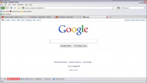
Google has recently released quite a tweak to its google.com web design to a select few users. Below are a couple of screenshots of the new web design from Google. Clicking the screen shots below will show the new web design, which features more squared off search button, a highlighted sidebar on search results and a change in default link colour to a significantly lighter shade of blue.
This also appears to be a slight re-brand of the Google logo as well. The Google logo in these screen shots are noticeably less bevelled than the current logo and is without the drop shadow on the existing logo.
Google Experimental New Logo Design – March 2010
New Google Web Design – Search Engine Results Page – March 2010

