By Matt Fennell
26th May 2015
Posted in Conferences, Industry, Rapid Web News
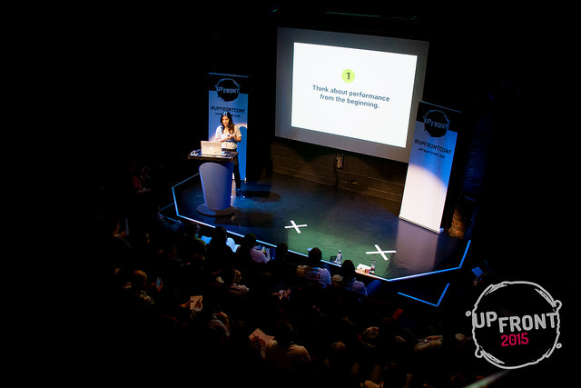
On May 19th, I was fortunate enough to be sent by Rapid Web Services to UpFront Conference 2015 at the Comedy Club in Manchester.
It was a long day, starting with a train from Stafford at 7.30am, and not getting back until around Midnight.
Below is a brief overview of my highlights, and what I personally took from the day:
Atomic Design
Brad Frost, 10:00 – 10:40
What a way to open the conference! Brad was confident and passionate; perfectly kicking off a day of incredible talks and demonstrations.
Brad’s talk made me realise just how important style-tiles and style-guides are in the modern process of web development: elements should be broken down to as abstract a level as possible, before being pieced together into more complex sections; such as the header or footer.
At the after party I got the chance to talk with Brad, who was as down-to-earth and friendly as I expected.
Jumping Into Front-End Testing
Alicia Sedlock, 10:40 – 11:20
As a front-end developer, the idea of testing does not fill me with joy. Therefore any method in which the process can be made to be more automated and less time-consuming, gets a from me.
Front-end testing is similar to TDD, but is written in JavaScript, with multiple frameworks available to developers. With no prior knowledge in the subject, Alicia’s talk showed me a great way to get started.
Her talk made me realise that it really is time to start taking front-end testing seriously!
The Disconnected Ensemble: Scattered Clouds, Underground
Soledad Penadés, 11:40 – 12:20
Soledad showed us that we can do so much more with our devices, and within our browsers. It’s crazy, that in 2015, it’s still so difficult to send links and files between devices, with many of us often using a 3rd party service.
Coming from Mozilla, Soledad explained how they are trying to create a more cohesive experience for users, even with no or limited internet connectivity.
Faster mobile websites
Dean Hume, 12:20 – 13:00
With more and more user’s browsing the internet on portable devices, with mobile connection speeds, it’s really time the web world woke up and developed for mobile.
As well as mobile-first design, and difference in UX, we need to be thinking about performance and speed related challenges.
With a mixture of facts and techniques, Dean’s talk was really insightful; highlighting multiple ways to improve mobile website loading speeds.
The Internet of Browsers
Ben Foxall, 14:00 – 14:40
Ben blew me away with his incredible demonstration on how you can connect multiple devices, before accessing a whole array of features.
Each member of the audience could visit a website, generating a unique ID, which was then used by Ben to pass through colours, sounds, and to access features, such as location and battery level.
My University Final Year Project used web code to access these similar features, making this talk particularly relatable and interesting to me.
Web Typography You Could Be Doing Now
Richard Rutter, 14:40 – 15:20
It’s amazing how simple changes to typography can have such a big affect on a website.
Literally the day after UpFront I went back to a completed design, took a closer look at the fonts used, and how others would work better and complement one-another.
Richard showed me the difference between heading fonts and content fonts, and even showed me a couple of CSS rules I’ve never heard of before (thank you!).
It’s important to remember that your choice of typography could be the difference between a customer staying on your site or leaving for a competitor.
Games Console Browsers
Anna Debenham, 15:40 – 16:20
As a young developer, I was particularly looking forward to hearing the ‘Young Developer of the Year’ Anna Debenham’s talk.
Going through all the different games console browsers, Anna highlighted how the different sized screens, different input-types, and different operating systems have affected the user experience.
With smartwatches selling well, and virtual reality devices about to enter the market, this talk was perfectly timed as these will become an even bigger challenge to developers over the coming years.
Design Decisions Through the Lens of Performance
Yesenia Perez-Cruz, 16:20 – 17:00
One of the biggest points I took from UpFront came in the final presentation by Yesenia. Most designers don’t consider performance issues, concentrating on creating unique, on-trend designs.
Designers should give websites a ‘budget’ which is then split between imagery, typography and content. Implementing this could really help with performance and managing clients requests.
The case-studies Yesenia used were perfect for what she was explaining; with everybody being able to empathise (we all have that awkward client!).
On a side note I ‘ed her American accent.
If you want to know more, or have any thoughts please tweet me @matfennell. The thoughts in this blog post are mine, and not necessarily the thoughts of Rapid Web Services.
I originally created this article for my personal website, so please check that out.
