By Matt Fennell
30th October 2014
Posted in Design, Our Work, Uncategorized
In the last 2 years one of the biggest changes in web design is how and what fonts are being used. Long-gone are the days where the only choices were Arial, Times New Roman or Comic Sans.
With the arrival of the ‘@font-face’ HTML rule, and with big name players such as Google launching services to make applying new fonts easier, the web has truly benefited.
Below we look at multiple sections of where and what fonts are good, along with our personal favourites here at Rapid Web Services.
Firstly, in the most basic form, there are two types of font: those which are used to be unique, grab attention and show off the company image and those used for legibility and easy clear reading.
Fonts to Grab Attention
With average users only giving their attention for 15 seconds your website needs to stand out from the crowd.
With current web trends focusing on large images, and more whitespace, the headings on your website need to aid users, and work with the graphics.
Below is a small collection of some of my personal favourite fonts, which can be viewed on projects I’ve designed for Rapid Web Services and in my personal time.

Bazar – Used on www.atomicthreads.co.uk

Bank Gothic – Used on www.grinnalltrikes.com

Caviar Dreams – Used on www.organisingpotential.com
Fonts for Easy Reading
Although reliable fonts such as Arial are heavily used for text content, there is now a wider range of alternatives.
A font used for content needs to be clear and easy to read, as they are often smaller in size and in larger blocks than headings.
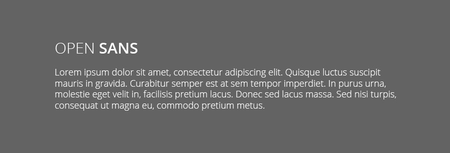
One of the favourites here at Rapid Web Services is Open Sans, which has a slightly more modern twist to it. Open Sans is becoming highly popular, with 12,637,762,872 views on Google Fonts in the last week alone.
We have used Open Sans on a couple of live sites so far, with many more in the process.

Open Sans – Used on www.bigmouthclothing.com and www.rapidweb.biz
Responsive Typography
It’s no good having a load of really cool fonts on your website for them to not display correctly when users view on mobile devices. This is where responsive typography comes in.
In CSS3 there are new values for sizing text, relative to the current viewport, these are: ‘vw’, ‘vh’ and ‘vmin’. Experts recommend between 50-80 characters on a line, no matter what sized screen. These units allow you to achieve that with scaleable text sizing.
These new values do take a little playing around with, yet isn’t this what you do at the moment anyway?
Below shows what the new values represent, with a video demo – courtesy of CSS Tricks:
1vw = 1% of viewport width
1vh = 1% of viewport height
1vmin = 1vw or 1vh, whichever is smaller
1vmax = 1vw or 1vh, whichever is larger
Great Resources
There are numerous places where you can go to download or include fonts – available for use straight on the web.
Google Fonts is one of the best – you simply find a font you want to use, include a link to the file (hosted by Google) and start using it.
A second great resource is Font Squirrel’s Webfont Generator where you can upload a local file and it will be converted for use on the web, including an example of how to use.
For assistance on how to start including new fonts, which are not supported by browsers by default see the W3C page.
Finally, the below sites are my top 5 for searching for and downloading (or purchasing) fonts:
- DaFont – http://www.dafont.com/
- 1001 Fonts – http://www.1001fonts.com/
- My Fonts – https://www.myfonts.com/
- Font Squirrel – http://www.fontsquirrel.com/
- Fonts – http://www.fonts.com/