By Ollie Reardon
28th October 2016
Posted in CSS, Javascript, Web Dev, Website Design
While Bootstrap 4 has polished up on the features of the previous major release, Bootstrap 3, several new features have been introduced to keep Bootstrap a solid, modern front-end web framework.
XL Columns
There is a new column breakpoint introduced in Bootstrap 4, Extra Large! Currently the Bootstrap 4 columns are as follows:
| Size | Pixels |
|---|---|
| Extra Small (col-xs) | <576px |
| Small (col-sm) | >576px |
| Medium (col-md) | >768px |
| Large (col-lg) | >992px |
| Extra Large (col-xl) | >1200px |
Compared to the previous breakpoints in Bootstrap 3:
| Size | Pixels |
|---|---|
| Extra Small (col-xs) | <768px |
| Small (col-sm) | >768px |
| Medium (col-md) | >992px |
| Large (col-lg) | >1200px |
Flexbox support
Flexbox support for Bootstrap has landed in the new version 4. It offers some useful features such as auto-columns and vertical alignment. It is not enabled by default due to web developers who need to cater for legacy Internet Explorer users, where there is only partial support.
Auto Columns
With bootstrap’s flexbox grid, you don’t need to specify the size of the column. Useful for dynamic content, for example:
<div class="container">
    <div class="row">
        <div class="col-xs">
            1 of 3
        </div>
        <div class="col-xs">
            1 of 3
        </div>
        <div class="col-xs">
            1 of 3
        </div>
    </div>
</div>
The code above will generate three columns of equal size. Developers can also specify a size for one column and the rest of the columns will fill their available space. See Bootstrap v4 docs regarding auto-layout columns for more information.
Bootstrap 4 cards
The cards component in Bootstrap 4 merges a lot of the Bootstrap 3 components together, which shared similar functionality. This has greatly reduced the file size of Bootstrap which is crucial for page performance when loading for end-users in rural areas or via slow mobile networks.
Bootstrap 4 Cards has replaced the following components from Bootstrap 3:
* Panels
* Wells
* Thumbnails
These all essentially work as a content container, therefore with cards, web developers can add card headings, footer and even embed list groups.
SASS Support
In Bootstrap 3, LESS was the pre-processor of choice. This has now been switched to SASS/SCSS.
REM Sizing
rem is now the unit size of choice, which was px in Bootstrap 3. rem is used where the size of an element will be affected by the sizing of the typography.
Ghost Buttons
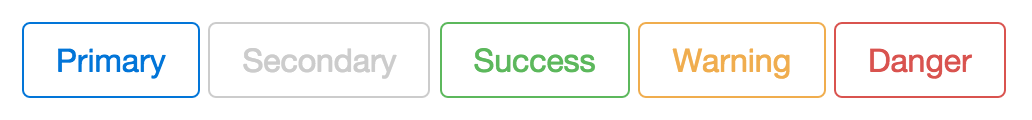
Ghost buttons (referred to as Outline Buttons) are a common trend on websites, in recent years. These are usually used as call-to-action buttons in Jumbotrons.
Do you require a new Bootstrap 4 powered website, or have an existing site that needs to be migrated over to Bootstrap 4? Contact us on our website or give us a call on: 01785 250 222