By Ollie Reardon
6th February 2014
Posted in Design, Website Design

What is Responsive Web Design?
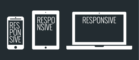
Responsive Web Design is the modern approach to designing websites for multiple device screen sizes such as Desktop, Laptop, Tablet and Mobile displays. With the increase of new devices as methods of surfing the internet in recent years, website owners have to be prepared to serve for the end user’s device requirements, for example a smartphone’s display is a lot smaller than a laptop or desktop monitor, therefore a website would need to scale down its content in order to display correctly for that display.
Not only is Responsive Design a benefit for the end user but will also help website owners to maximise their user base by ensuring their website is accessible to the end user regardless of what device they are viewing the website on, by completely removing the necessity for zooming or scrolling horizontally in order to view the website’s full contents.
Use the screen space to maximise your central content
Responsive Design is not just about making a website readable on small screen spaces, with the rise of High Resolution displays this allows us to centre the central point of discussion of the website to use up as much screen space as possible while reducing the less important content’s screen space in order to fit on a mobile display without the need of additional zooming or scrolling.
Reduce the cost of mobile development
In the past, in order to make a website for a mobile display, developers used to redirect the user away from their desktop site to a specifically designed mobile site. Even though it is displaying roughly the same content and uses a similar design, it is built the exact same way as if the developer was making a brand new site. This, of course, is now seen as a very inefficient way of developing a website and could waste a lot of time and money.
A good responsive design practice is to try to reuse any existing content and styling that has already been developed for desktop screen sizes, for example, instead of developing a navigation bar to use a fixed pixel width such as 800 pixels wide, instead a developer should define the width of a navigation bar by using percentages such as using 100% of the available screen space regardless of the actual screen resolution of any devices used. As a result the developer has not only reduced the required codebase behind the mobile size but has saved a lot of time by reusing content that would be needed for a desktop or mobile site.
Increase performance
One of the advantages of Responsive Design is that you will be able to disable desktop only content such as Adobe Flash-dependant advertisements on mobile devices, considering the popular mobile platforms do not support flash-based content will considerably speed up the process to load a web page especially on a slow mobile network and save valuable bandwidth for the end user if they are limited to only a few megabytes of mobile data.
When should you implement Responsive Design?
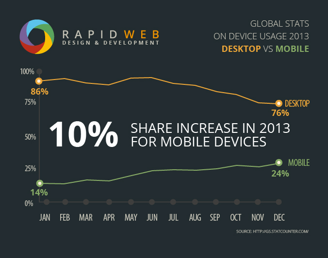
Have you ever looked at your website’s traffic statistics? Is there a lack of mobile users engaging with the content on your website? This could be because your website doesn’t work well with mobile screen sizes so end users don’t want to stay on your website. With the rise of mobile technology over the past few years users are ditching the traditional desktop or laptop computing in order for a more mobile solution. In short, unless you’re planning on a revised site design in the near future (where Responsive Design can be implemented as part of the new design), you should be considering the implementation of Responsive Design now if you want to keep your site relevant and accessible to users.


For more information on our our web design services please see here
If you need more help or advice on Responsive Design, please don’t hesitate to contact the Rapid Web Services team today to discuss this further. You can contact us via email at contact@rapidweb.biz or by calling us on 01785 250222