By Kirsty Gasston
25th March 2013
Posted in CSS, Design, Ecommerce Website Design, Technology & Software News, Web Dev, Website Design
There are so many ways to access the internet and view websites now – computers, laptops, tablets, smartphones – and figures show that over 10% of internet browsing worldwide is now done via a mobile browser. Of course users expect websites to display and function correctly across all of their devices. So what do we do as web designers to make sure that this is the case? We design sites to be responsive. Media queries are used to recognise the browser’s width and capabilities (such as if it is touchscreen), and different styles and functionality are applied to a website to suit the user’s device. For example, a smartphone will have a much smaller screen area for the display of content. And websites being used on touchscreen devices need to have elements and navigation that are big enough to touch with fingers rather than a mouse cursor.
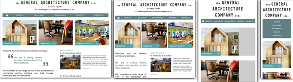
A great example of a site that we’ve developed recently with a responsive web design is the new website for The General Architecture Company. The site has been developed with 4 different stylesheets – 1 for monitors and laptops, 1 for tablets in landscape view, 1 for landscape smartphones and 1 for portrait smartphones. We’re also working on a responsive design for our new client Atomic Threads, which will enable users to easily shop online for their range of retro tshirts and clothing across all of their devices. So if you’re looking for a responsive design for your new or existing website, speak to the Rapid Web Services team today.
For more information on our web design services: https://rapidweb.biz/web-design/