By Matt Fennell
2nd January 2015
Posted in Design, Website Design
Each year new web trends come along, some last the course and stay, whereas some only have a moment in the spotlight. I’ve now been engaged in the web world for 5 years, and have seen plenty of trends come and go.
The list below is based on my opinion of what will become popular in 2015, and what previous trends will continue to reign supreme.
- Webgraphics
Infographics have exploded onto the web, largely thanks to social media websites such as Twitter. Infographics provide viewers with lots of information, but in a far nicer and easy to read manner than plain text.
After how popular infographics have become, we’re about to see a new, yet similar version: webgraphics. Webgraphics will look just like infographics, but will allow more flexibility and be interactive when users click or hover on them.
Webgraphics are also known as ‘Responsive Interactive Infographics’, meaning they are fully mobile optimised, adapting to the users screen size and resolution.
I’ve found two very different, but equally engaging webgraphics for you to browse. The first one shows the Daily Dose of Water, illustrating and allowing users to calculate how much water they use. This example is more similar to infographics, yet Flash is required for it to run.
The second example helps users to track their time better, allowing them to be more productive in a day. This example is a one-page scrolling website which uses flat-design and icons to show the stats and percentages to the user. DeskTime have integrated 4 other trends into this example making it one of the best currently available.
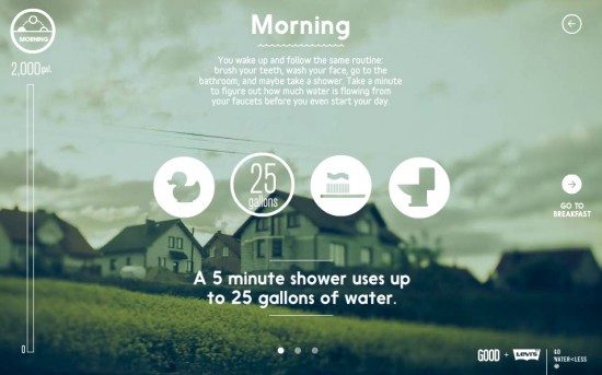
Screenshot showing the Daily Dose of Water webgraphic
- Full-Screen Video
In the past few years the traditional image carousel has got larger, with more vibrant and bigger images. This is due to faster internet speeds, and larger devices, stopping designers being limited by hardware capabilities. This has slowly led to full-screen background images, especially on one page websites.
YouTube and on-demand players have brought video to the forefront of the web, and now it’s time for traditional websites to follow suit. The HTML5 video tag is proving popular amongst designers, with a lot now changing designs from static images to including video.
Due to the annoyance of sound, muted videos are most popular, and often run in a loop.
If the old phrase is true and a picture can paint 1000 words then videos are surely going to be in the millions. This extra information can help with conversion rates or simply help to get information across to a user in a quicker and easier manner with no scrolling required.
One of the best examples we have found is from PayPal UK who overlay the video with semi-transparent typography, and a button to ‘Find Out More’. Another large brand who have implemented full-screen video is Diesel.
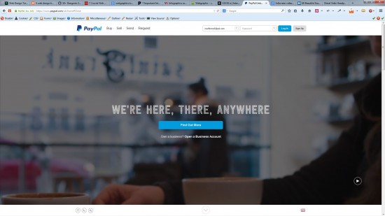
Screenshot from the PayPal UK website homepage, showing full-screen video background
- Mobile First Design
It’s no secret that mobile devices are becoming even more popular for browsing the web on. For the biggest websites such as Facebook and Apple, there are already more mobile users than desktop users, and with phablets emerging this could be the turning point for almost all websites.
The growth has been exponential, and with smartphones here to stay, so is the mobile web.
Over the past few years it’s almost felt like we have been patching websites to work on these screen sizes and resolutions quickly to please clients. 2015 is the year of change, where mobile-first design is used for all new designs and front-end development.
Luckily there are some great responsive templates we can use to aid the transition, with the most popular (and my favourite) being Twitter’s Bootstrap.
As Darwin once said “It is not the strongest of the species that survives, nor the most intelligent that survives. It is the one that is most adaptable to change.” If you don’t take mobile-first seriously (and a lot of designers still don’t!) then you will be left behind, and the industry will move on without you!
The below image shows the difference between responsive web design, and mobile-first web design. The former is where a design is first made for desktop, and is then changed to fit a mobile sized screen. The later, and better, shows designing for a mobile-first and going in the opposite direction.
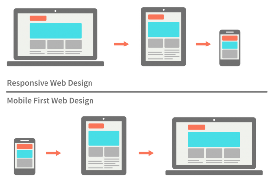
Image from MetaMonks article “Why ‘mobile first’ is the new ‘responsive’” written in Philipp, 2013.
- Masonry Grid Layout & Card Design
The masonry, adaptive grid, combined with using cards looks here to stay in 2015. Cards are best described like playing cards – often white with a light border and shadow. Cards provide users with bite-size pieces of information, and can be combined with graphics, like on Pinterest.
Cards are often the entry points, where users can click on specific cards to get more information if they so wish. This allows users to view lots of information in a small amount of space.
The majority of the ‘big boys’ are using cards, including: Facebook, Google Now, Twitter and Pinterest.
Cards work alongside multiple other common trends such as the minimalist approach, and full screen websites (see below).
The masonry grid, which creates responsive columns based on screen size works well alongside cards. Masonry grids allow cards to be dynamic in height, yet makes all the content flow next to each other, reducing whitespace.
As mentioned above, Pinterest is one of the best examples of how to combine the masonry grid with cards to provide a sleek, interactive and responsive visual display to users.
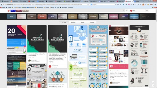
Screenshot showing a Pinterest board of Web Design Trends
- Full Screen Websites
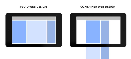
Containers have been one of the most popular web design trends of the last 10 years; but I think that’s about to change. When containers first became popular screen sizes were smaller, and the mobile web simply did not exist. Today’s web world is totally different: with larger monitors for desktops, and a huge array of tablets, phablets and smart phones all capable of browsing the web.
Containers limit content to a specific width area on your desktop, meaning there is often a lot of whitespace to the left and right. This is either left as whitespace, or is used to show advertisements or promotions – neither of which are essential.
I think 2015 is the turning point, with more web designs using the entire screen real-estate and being truly mobile-first and flexible.
Facebook and YouTube both use the entire screen now, however both still use a container for the main content section. Pinterest is a far better example of how to use the whole screen.
The container has proved hugely successful, and even has its own HTML5 element. Apart from dashboards I estimate 90% of websites use a container, but with responsive and mobile-first web this has to change.
My challenge for all web designers in 2015 is to design your next site to be truly fluid, and don’t limit content to a container of any sort. Give it a go and let me know how you get on, I’d love to see some of your work.
