By Tim Lees
21st March 2018
Posted in Website Design
The front page of a website is more often than not the single most important page when it comes to your website. The homepage has a difficult job as it needs to do many different jobs; it often draws the most traffic of any single page on your website and to a first time visitor it is usually the first page that is seen so the homepage has to act as a shop window to your service or products, inviting users to convert in the guise of either signing up to a service, getting in touch or purchasing a product.
However, it can’t just be an out and out sales landing page as it needs to introduce visitors to what your website is about, encourage users to explore your site further and ensure there is a level of trust introduced between the user and the service you are offering.
Below, in no particular order of importance, are 10 ways to help the content of your homepage succeed in living up to it’s ‘most important page’ title.
1. Good, considered imagery
Using large, high-quality images gives the homepage an immediate aesthetic and visual quality that can build an instant enticement for users to explore the homepage further. Choosing the correct imagery is extremely important in web design. You want to enhance the message behind the service you are providing. Avoid using poorly taken images, images that are not the correct dimensions of the device you are targeting and stock images that are considered ‘over the top’ and ‘cheesy’.
2. Integrated video
If you have the budget then integrating a full page video that supplements your core message can have a bigger visual impact than imagery. If the production values are right then a short video that loops can hold a visitors interest and enhance the message of the website. We recently incorporated such a video for a local fruit farm, Littywood Farm that does a good job of promoting the core service of the company.
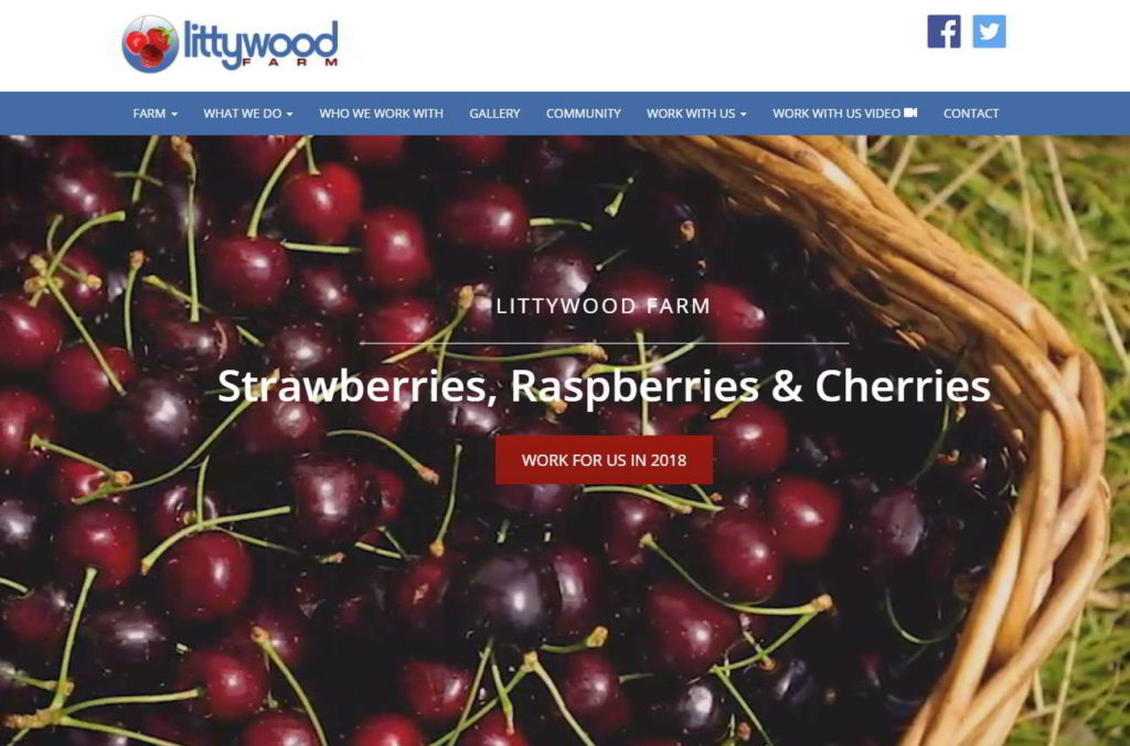
Good use of high-quality video to reinforce website key message
3. Main and subheadings
Arguably the most important single element of the website, the main heading and subheading need to summarise in very few words what the website is whilst at the same time selling to the user why they should continue browsing your site. When a first time visitor comes to your website then these written elements are likely to be the first things that are seen. If these elements are too wordy, don’t visually have an impact or do not summarise succinctly then a visitor will be more inclined to leave the website. The main heading should sum up the service of the website whilst the subheading should complement the main heading, building trust with the user by giving a hook of the service.
Consider the website of online payment platform Stripe and the main heading and subheading used. This is a good example of these two headings working well together. At the time of writing, the main heading, “The new standard in online payments” explains the service they provide whilst dropping in a snippet of why they believe they are a step above other solutions with the phrase “new standard”. Their subheading then goes on to reinforce this core message by telling the user that they are “the best software platform for running an internet business”, backing this claim up with stating they “handle billions of dollars every year”.
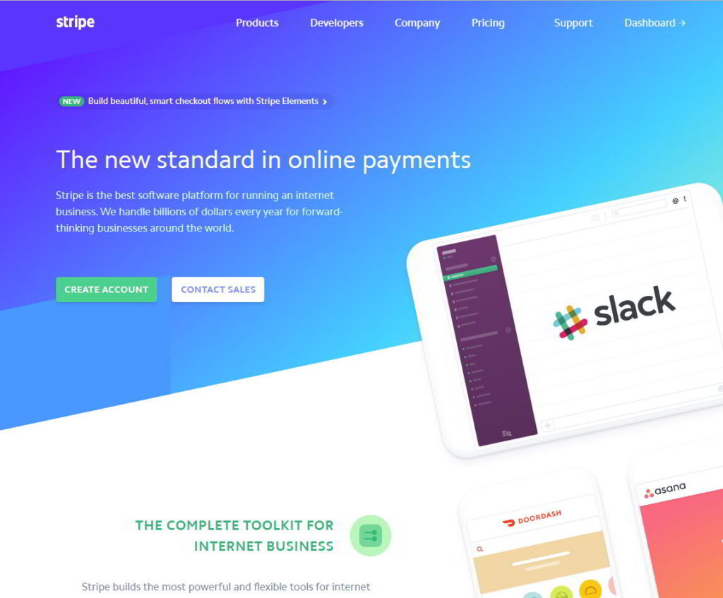
An example of a considered heading and sub heading
4. Primary and supplementary Calls To Action (CTAs)
Many service-based websites supplement initial headings with a primary call to action. This is designed to explicitly try and convince a user to take a positive action in terms of the service on offer whether that is simply encouraging the user to get in touch or if it is directly leading them to make a conversion by signing up to the service.
The homepage should back up this primary Call To Action with supplementary CTAs well positioned throughout the page. These CTAs could be designed to lead users to other areas of the website, display primary methods of getting in touch or reinforcing the message of signing up for a service.
5. Snappy, short copy
Throughout the homepage, the content copy should short and to the point. Avoid long narratives that will potentially dissuade the user from exploring the website further. If a user is interested in finding out more then use targeted service pages to explain things further with longer text content. For further information on writing good content take a look at a previous post we did on writing website content.
6. Navigation
As the homepage acts as a primary gateway to the rest of the website, then it is important to make sure that the navigation on your website acts as a simple way to easily explore the rest of the site through a clear, visual, hierarchical navigational structure. The use of a sticky menu that sticks to the top of the website as the user scrolls that is simple and clear in its presentation is a good way of allowing users to navigate a website easily, no matter where they are currently on the page. An online London guide magazine website we developed called The Nudge shows how a sticky menu works. Reinforce key links of the website and ways of getting in touch within the footer of the website.
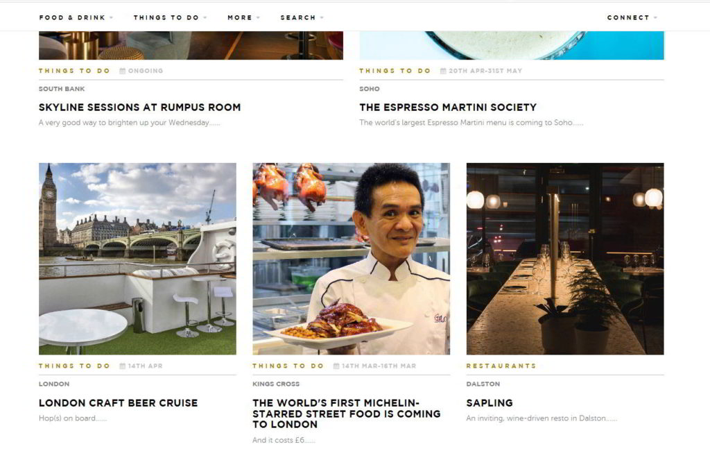
An example of a sticky navigation on thenudge.com
7. Active news/blog feed
A good way of showing to a potential customer that you are an active, up to date company is to make sure you have an active blog on the website that reinforces to the user that as a company you are concerned about keeping your visitors engaged.
8. Social media integration
Showing a visitor to a website that you have an active presence on social media is a good way of building trust between you and the user. This means that there is a fallback for a user to interact with you as a company as well as getting potentially great feedback that builds further trust and to a certain extent that you are prepared to be immediately accountable. No company providing a quality service wants to risk having predominantly, negative social media feeds full of angry, disgruntled customers.
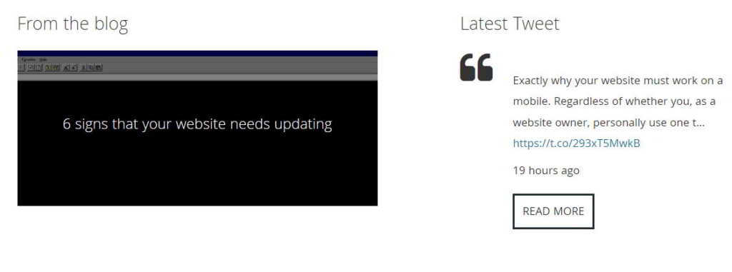
Active blog and social media feeds help build trust with the user
9. Testimonials
Testimonials on the homepage are a great way of building trust with a user. A customer who is unsure whether to sign up to your great service or purchase a product maybe swayed positively if there are testimonials and/or links to case studies showing success stories you have had with clients.
10. User retention
If a user has not been persuaded by your primary conversion goal on the website then make sure there is an option of a second conversion that does not necessarily commit the user financially to any outlay but allows you to keep in touch with that user. A ‘Subscribe to’ facility on the website is a great way of making sure that user interaction is retained if they are then on your monthly newsletter list.
Do you think your website homepage can be improved? Contact the Rapid Web team on our website or give us a call on 01785 250 222.